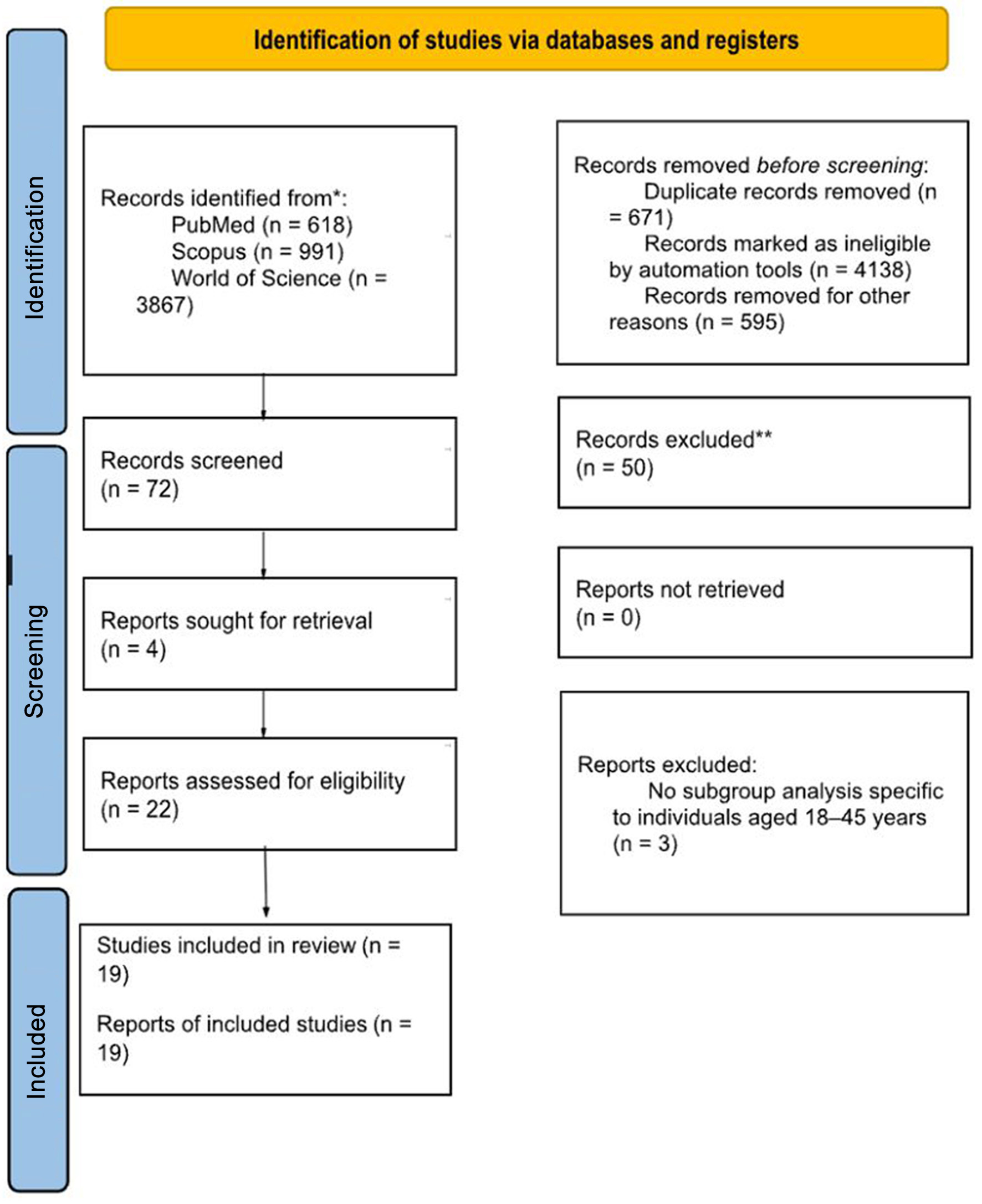
↓ Figure 1. PRISMA 2020 flow diagram of study selection. Flow diagram showing identification, screening, eligibility assessment, and inclusion of studies evaluating renal tumors in young adults (18–45 years).
| World Journal of Nephrology and Urology, ISSN 1927-1239 print, 1927-1247 online, Open Access |
| Article copyright, the authors; Journal compilation copyright, World J Nephrol Urol and Elmer Press Inc |
| Journal website https://wjnu.elmerpub.com |
Original Article
Volume 15, Number 2, April 2026, pages 42-54
Renal Tumors in Young Adults: A Systematic Review and Meta-Analysis of Epidemiology, Clinical Features, Histopathology, and Outcomes Over Two Decades
Figures
Table
| Study | Selection | Comparability | Outcome | Overall NOS |
|---|---|---|---|---|
| The figure presents domain-specific star ratings for selection (max 4), comparability (max 2), and outcome (max 3) across 16 studies on renal tumors in young adults. Overall scores range from 0 to 9, with risk of bias categorized as low (7–9 stars), moderate (4–6 stars), or serious (0–3 stars). Higher scores indicate lower risk of bias. | ||||
| Abou El Fettouh et al, 2002 [7] | ★★☆☆ | ☆☆ | ★★☆ | 4 |
| Akhavan et al, 2015 [3] | ★★★★ | ★★ | ★★★ | 9 |
| Aslan et al, 2018 [9] | ★★☆☆ | ☆☆ | ★★★ | 5 |
| Aziz et al, 2014 [13] | ★★★★ | ★★ | ★★★ | 9 |
| Cakici et al, 2020 [8] | ★★★★ | ★★ | ★★★ | 9 |
| Clemmensen et al, 2018 [17] | ★★☆☆ | ★☆ | ★★★ | 6 |
| Eggener et al, 2004 [10] | ★★☆☆ | ☆☆ | ★★☆ | 4 |
| King et al, 2014 [15] | ★★★★ | ★☆ | ★★★ | 8 |
| Lopez et al, 2010 [12] | ★★☆☆ | ☆☆ | ★★☆ | 4 |
| Mohsin et al, 2012 [11] | ★★☆☆ | ☆☆ | ★★☆ | 4 |
| Nayyar et al, 2022 [1] | ★★★☆ | ★★ | ★★★ | 8 |
| Palumbo et al, 2020 [16] | ★★★★ | ★★ | ★★★ | 9 |
| Siemer et al, 2006 [4] | ★★★☆ | ★☆ | ★★★ | 7 |
| Taccoen et al, 2007 [5] | ★★★☆ | ★☆ | ★★☆ | 6 |
| Xu et al, 2015 [14] | ★★★☆ | ★☆ | ★★★ | 7 |
| Xue et al, 2024 [6] | ★★★★ | ★★ | ★★★ | 9 |